Mobile Screenshots
These screenshots were generated from the iOS simulator using the automated Maestro-based capture flow in the mobile app repo.
Visual product tour
Use this page to orient new teammates, support demos, and give QA a shared visual reference for the mobile experience.
What to look for
- clear context before capture starts
- fast, focused data entry during the capture flow
- reporting surfaces that reflect field activity back to the user
Screen map
Primary surfaces
Annotated overview
Home screen guidance
Use this annotated view when onboarding teammates or reviewing whether the app communicates orientation, action priority, and trust clearly on first launch.
The main action should be obvious enough that a field user does not pause to figure out how to start capturing.
Core destinations should be visible and understandable without relying on prior product knowledge.
The user should understand where they are and whether the app feels stable after login or app resume.
QA check
What to verify on mobile screenshot review
Screenshot pages should not just prove the UI exists. They should help reviewers see whether the mobile product communicates speed, clarity, and trust.
- can a new viewer tell what the primary action is within a few seconds?
- do labels and hierarchy make sense without spoken explanation?
- does the product feel like a field tool instead of a cramped admin screen?
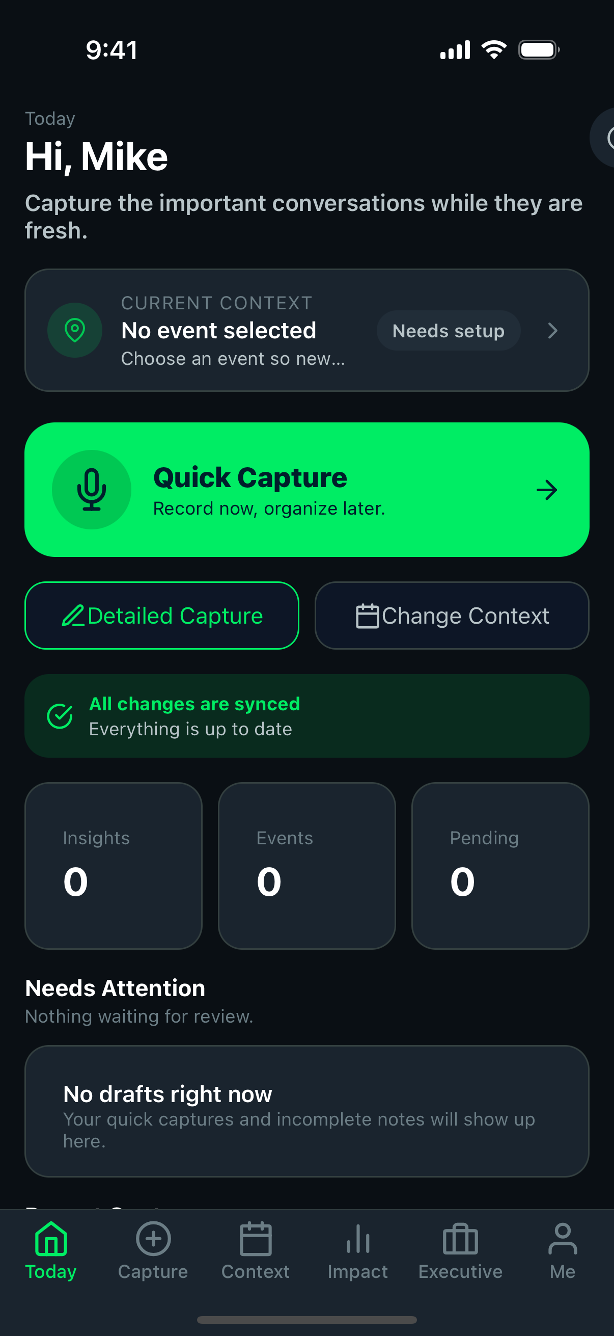
HomeThe launch point for everyday field activity.
- should orient the user immediately after sign-in
- should make primary actions easy to find
- should feel stable when returning from background state
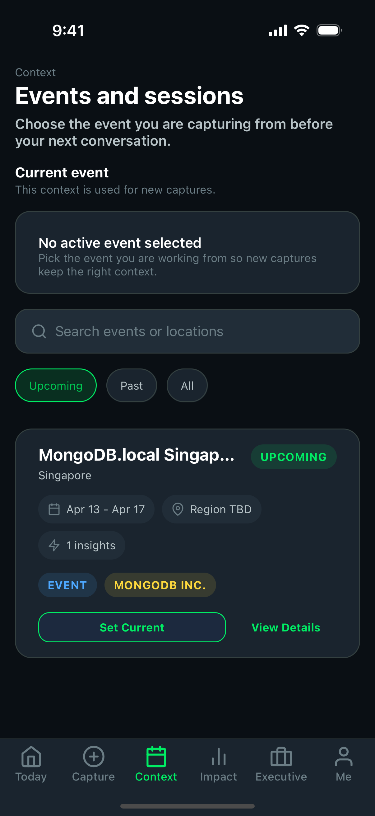 Context and events
This screen grounds capture in the right event or session.
- event context should be easy to confirm before capture
- later admin filtering depends on this metadata being correct
- bad context selection creates misleading downstream reporting
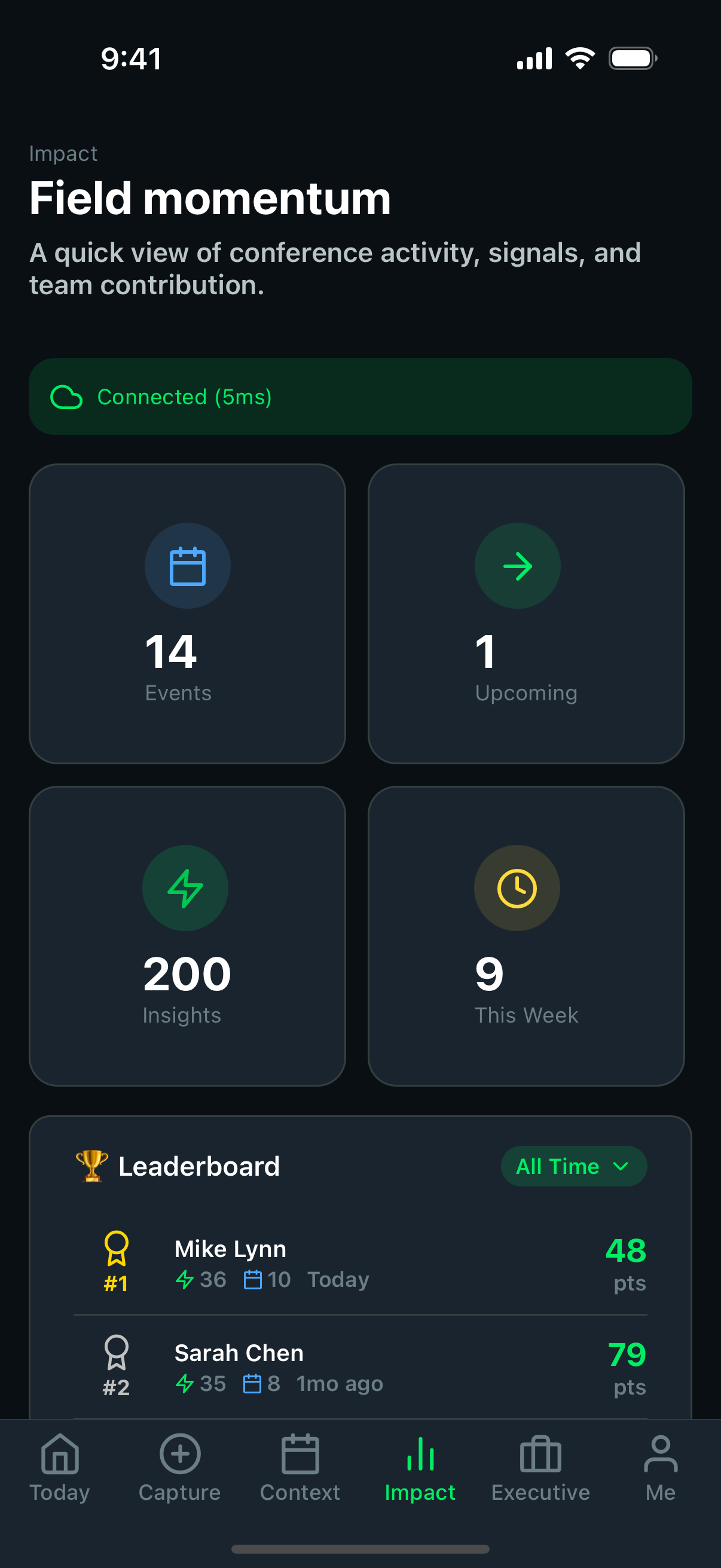 Impact dashboard
Shows feedback patterns and contribution outcomes back to the field user.
- metrics should feel readable on a small screen
- visual summaries should reinforce that submitted data matters
- dashboard content should stay useful even after intermittent sync
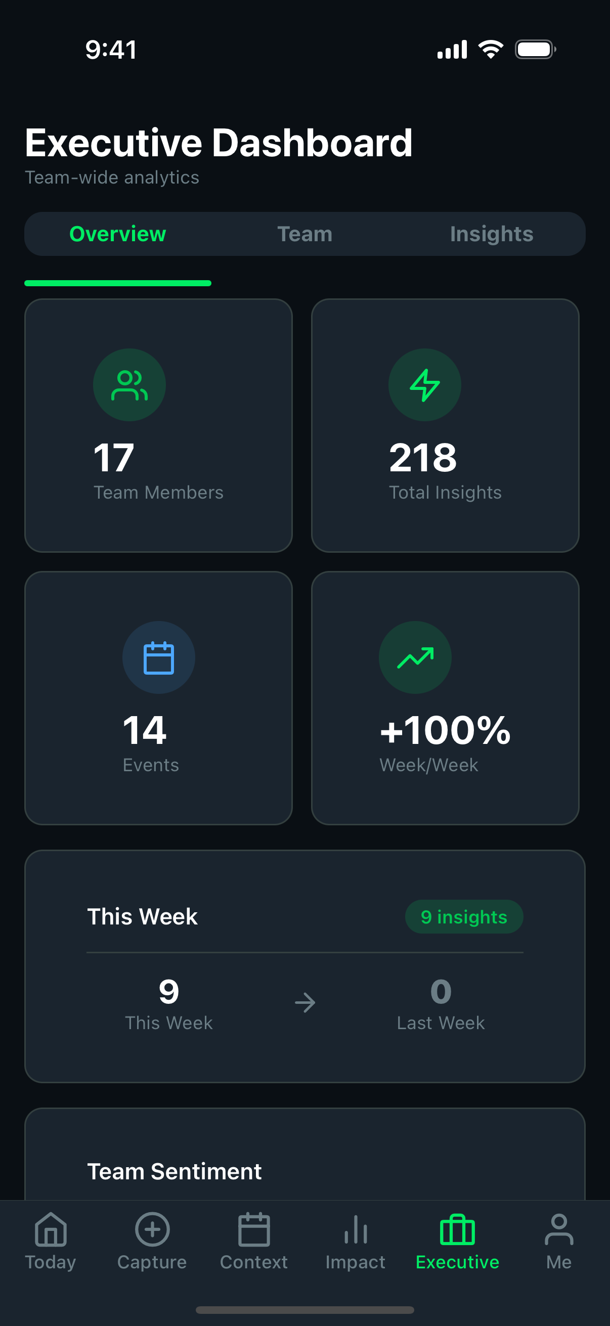 Executive dashboard
A higher-level view of performance, sentiment, and strategic signal.
- should communicate trend information quickly
- is useful in demos when explaining the value of captured insights
- should stay consistent with the admin reporting story
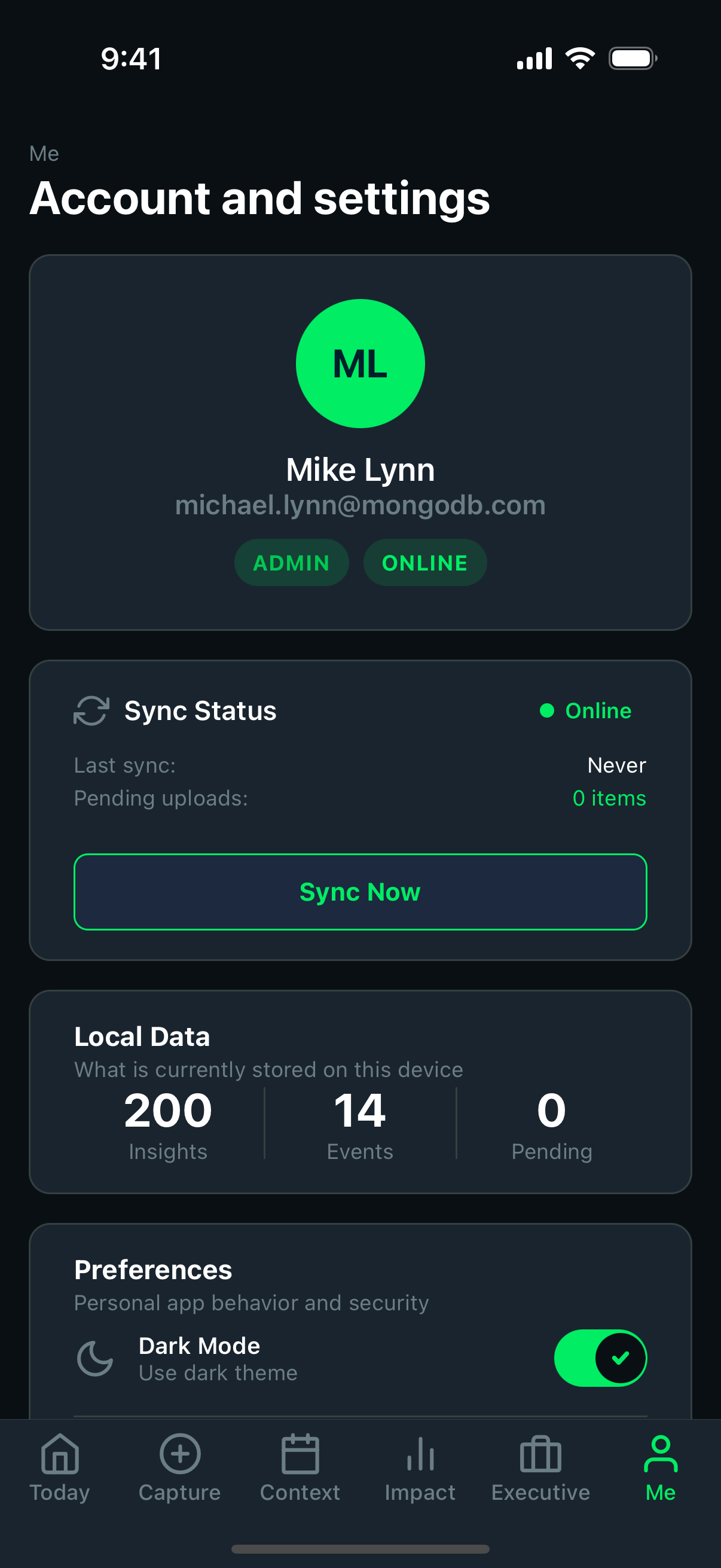 Profile
Holds account and session-oriented controls around the field workflow.
- users should be able to understand identity and account state
- support actions should be easy to reach without cluttering core capture screens
- session recovery should still feel trustworthy here
Capture flow sequence
Annotated capture stage
What the capture flow should communicate
This part of the product carries the most strategic weight. The screen should reduce hesitation, protect clarity, and reinforce that the user can save without fear.
Metadata choices should feel understandable enough to support quality without interrupting momentum too much.
The user should clearly understand what part of the flow they are in and what is left to do.
Selections should feel reversible and low-risk so the user keeps moving instead of second-guessing the workflow.
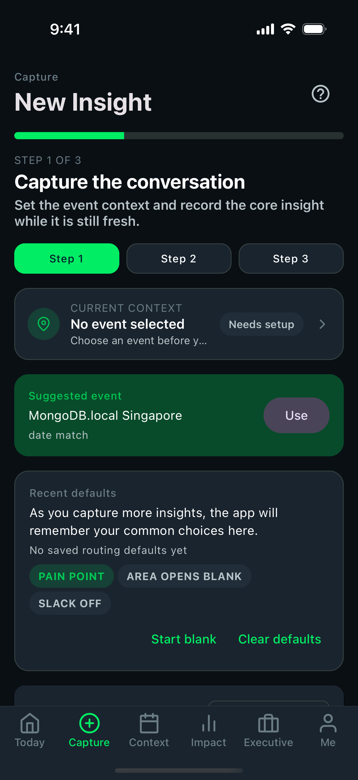 Capture step 1
The opening step should get the user into capture with minimal friction.
- starting fields should feel obvious, not intimidating
- voice or text entry should feel like the user can proceed quickly
- screen hierarchy should support event-floor usage, not desk usage
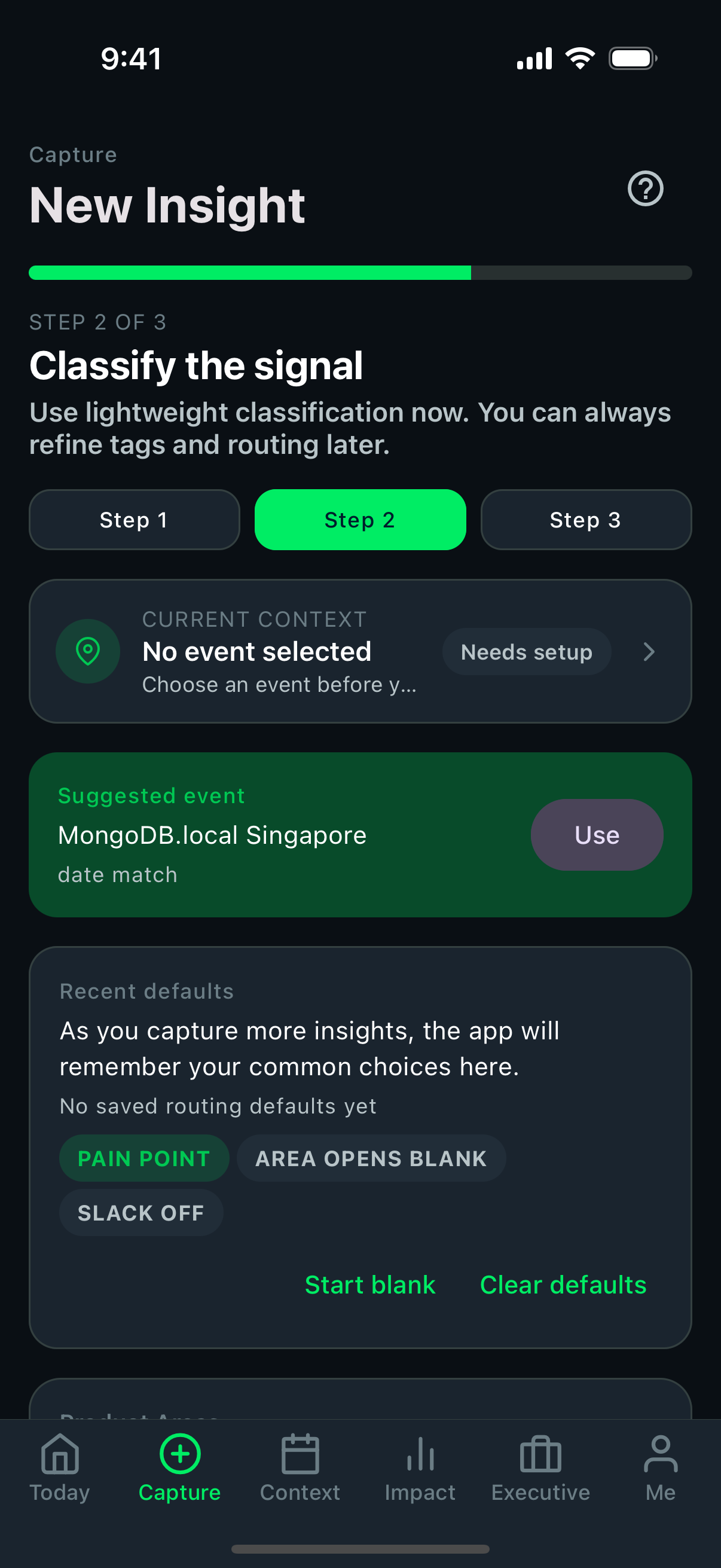
Capture step 2This stage adds structure so the insight becomes useful later.
- classification choices should be understandable at a glance
- product area and sentiment selection should not slow the user down too much
- important metadata should stay visible enough to avoid mistakes
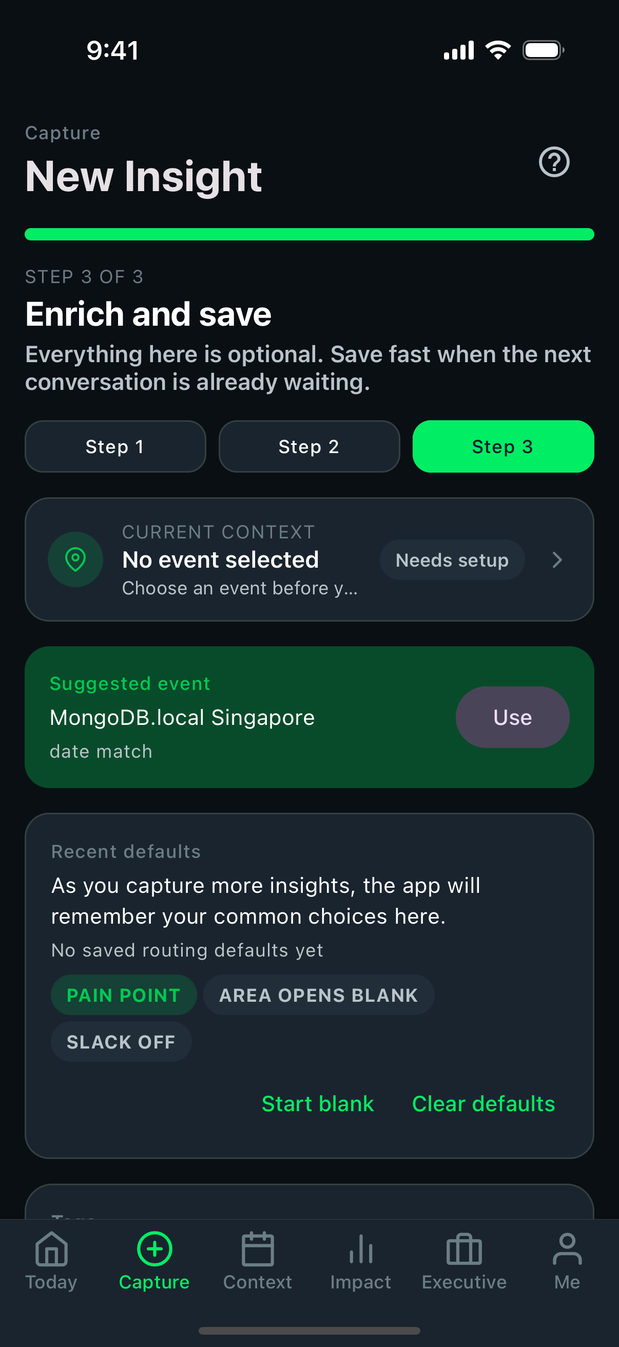 Capture step 3
The final step should close with confidence and preserve the user's momentum.
- save affordances should be unmistakable
- completion should communicate success even before sync finishes
- the user should not worry about losing work at the last moment
Risk
Where screenshot quality can hide real product risk
- a visually clean screen can still be confusing if action order is not obvious
- a form can look polished but still introduce too much cognitive load for event-floor usage
- success states must communicate trust, not just visual completion
Source workflow
The source automation currently lives in the mobile repo:
docs/SCREENSHOTS.md.maestro/screenshots.yamlscripts/run-doc-screenshots.sh